Inspired by poetry, philosophy, the natural sciences, and art history, Joshua Flint’s work is in conversation with the everyday and the eternal.
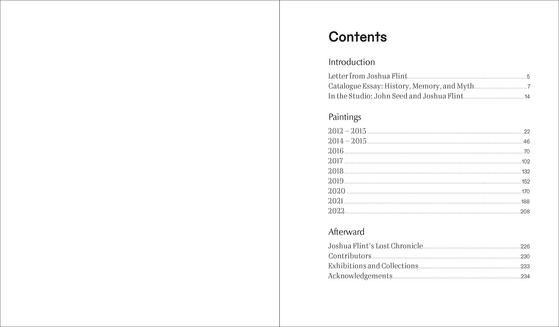
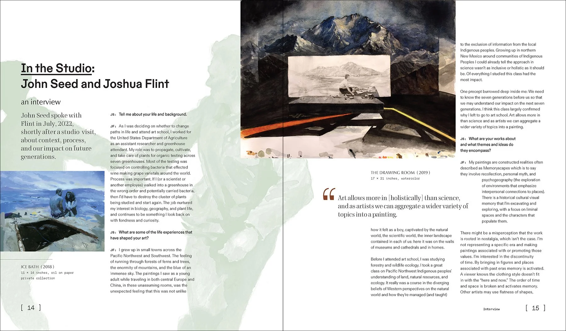
Selected page designs, above.
CHALLENGES AND SOLUTIONS
One of the exciting, and challenging, parts of designing this book was helping this incredibly prolific painter sort through and choose from over 10 years of work to include. The fun part came in finding the poetry that happens when his images talk to each other on the same page spread.
We experimented with more complex layouts that would allow more conversation to unfold between the paintings, but in the end decided to keep things straightforward so that readers could explore each image, with space to rest the eyes.
Sorting his printmaking work and rough studies into watermarks for the front of the book and section dividers allowed me to play with rhythm and offbeat layouts that compliment his work and allow dialogue between the images.
Thoughtful design choices pay homage to Flint’s practice as a teacher. I got a little nerdy with type choices. Some of his fans might appreciate it, but really all the components should just “feel right” and emphasize the work.
A custom icon inspired by the title, above, is used on the spine, title page, and as endmarks for the articles.
THE BOOK
Memory Forest is the first retrospective collection by artist Joshua Flint. His oil paintings are featured alongside preliminary studies developed in a range of materials including ink, watercolor, and acrylic.
Inspired by poetry, philosophy, the natural sciences, and art history, Joshua Flint’s work is in conversation with the everyday and the eternal. The liminal spaces and characters in this volume combine both figuration and abstraction, and appear to be fracturing and forming simultaneously. Flint’s work is in public and private collections throughout the US and Europe.
This is a limited-edition run of 300 books and will not be reprinted.
- Paperback, 234 pages
- Selected works from 2012-2022
- Full color, with 200+ images
- Catalogue essay by John Seed
- Interview with John Seed
- Essay by Ibis Sanchez-Serrano, from a collector's perspective
- Limited Edition, 300 books
- Signed and Numbered
- Dimensions 11.75" x 10"
Wrap cover, above.
TYPOGRAPHY
I chose modern typefaces that reference classics, with quirks that might feel slightly offbeat, with connections to Flint’s practice as a teacher and connections to his Nordic contemporaries with a modern realist painting style.
For example, I chose ABC Dinamo’s font Favorit for the majority of the text because it features an 8 that looks upside-down. It is mostly a straightforward, low-contrast font with strong geometric shapes. But the mechanical quality gives way to quirks like that 8 that are either slightly funny/playful, or when used next to Flint’s images, maybe a bit unsettling. I flipped a common hierarchy by using the monospaced font for headings, and the regular version for micro text.
Finnish type designer Teo Tuominen describes his Vieno, the serif typeface (most visible in pull quotes and on the back cover), as “a high contrast typeface that combines sharp mechanical shapes with round and organic forms and wavy tuscan-like serifs. It aims to portray a sense of elegance while at the same time looking slightly odd and out of place.” Vieno is offered by Portland-based foundry Future Fonts, and Tuominen is also a teacher, and I loved these connections to Flint’s practice and influences.
LAYOUT CHOICES
A larger center margin makes the spreads seem even bigger when images are placed on the face edge of the pages. Large, landscape-oriented paintings are often allowed to bleed across the spread, but all are printed without cropping them down, so the entire image can be seen.
We chose a book size that would trim off the least amount of paper waste, while still allowing us to bleed off the pages. A bright white, coated, matte paper lets the details in canvas and paint texture sing.


