Bitch: A Feminist Response to Pop Culture
CHALLENGE
Heading into Bitch Media's 20th year, and fresh off a complete website redesign and technology upgrade, the magazine needed a refresh of both content and design to become the Bitch Media of the future.
The magazine Bitch: A Feminist Response to Pop Culture needed to be forward thinking and still respect the history of the organization, especially with feminism on the rise in the public consciousness.
We wanted to position ourselves as a thought leaders in the cultural moment, respond to our longevity in this space, and not rest on those laurels in an era where folks are jumping to be more innovative with culturally relavent content.
SOLUTION
Contrasts were set up between the strong grid, a whimsical but clean icon system, and loads of illustration and collage to break the math of the design.
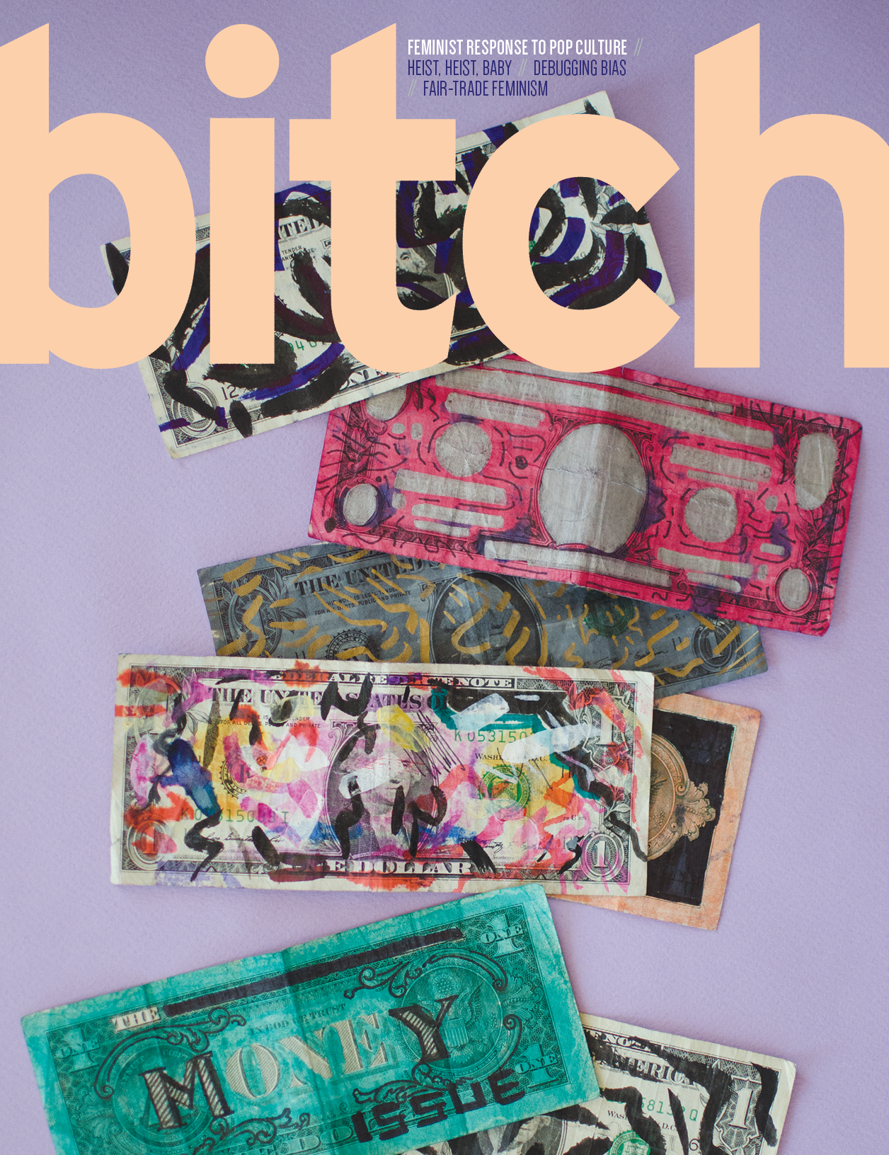
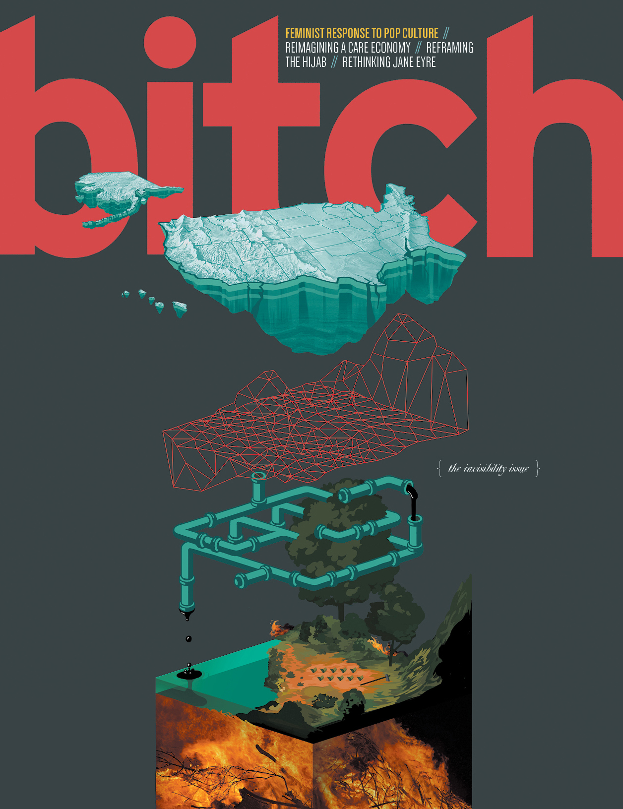
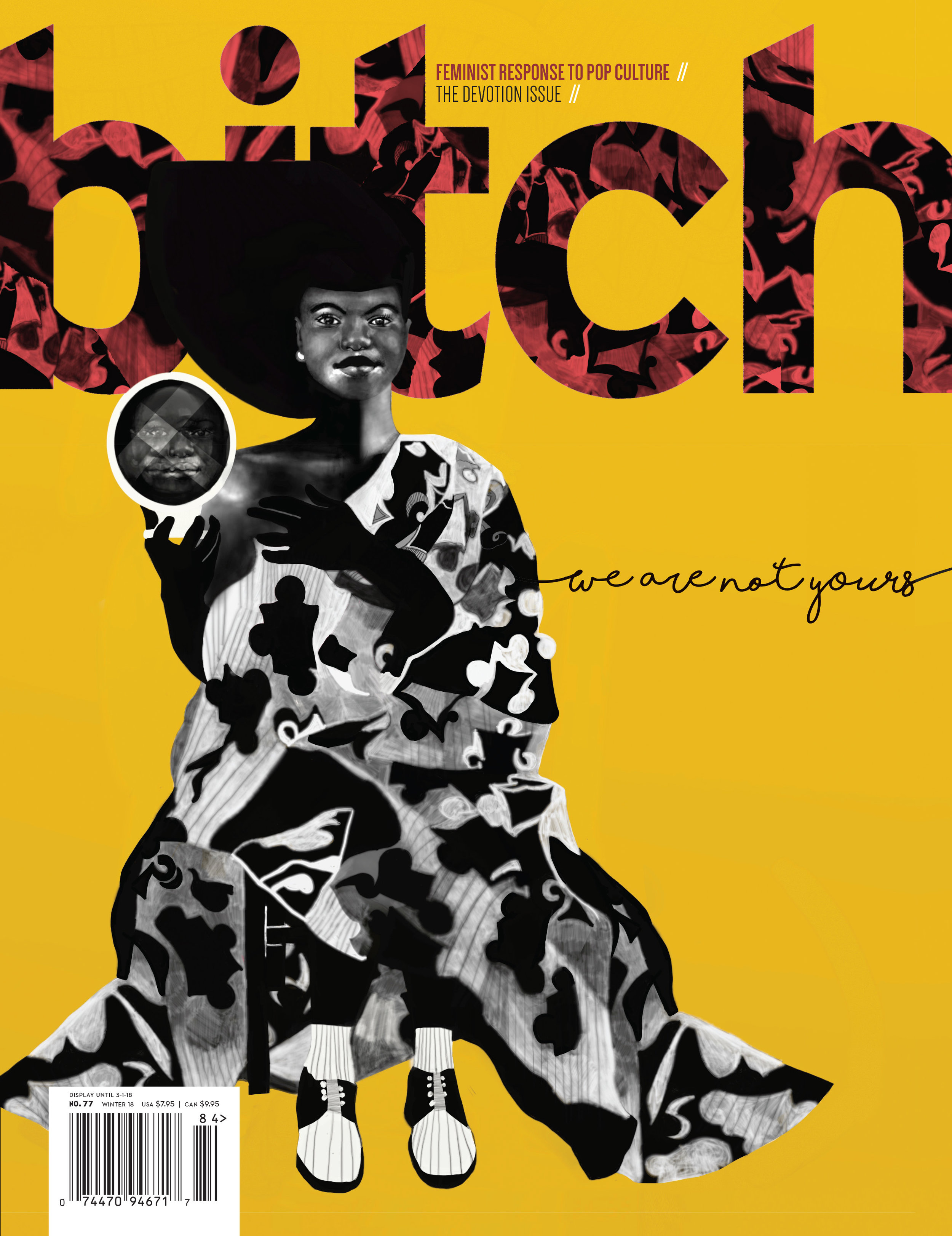
Each section uses the elements of the system differently to establish varied pacing and hold reader interest. With every issue, a new style of hand-drawn type is created or commissioned to fit the flavor of the issue's theme.
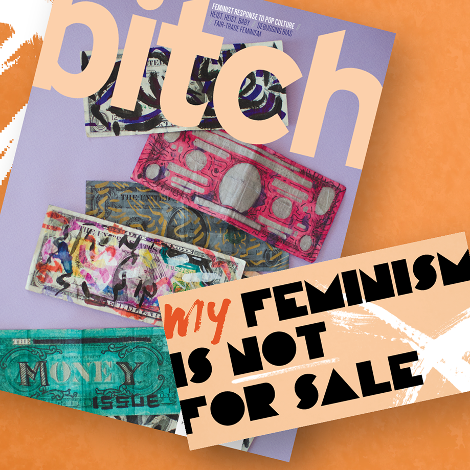
The logo / masthead on the cover bleeds off the page at either side, announcing and reclaiming the word. Minimal cover lines tease the content, while the artwork and masthead communicate boldly online. Cover design styles are intentionally varied, speaking to the plurality of perspectives within feminism.
Integrating hand-drawn type, a more engaging front-of-the-book section, and an icon system which could be used cross-platform, the new design hearkens back to Bitch's roots as a handmade zine—but grown up, to face the next 20 years of feminism and media.
Integrating hand-drawn type, more engaging front-of-the-book section, and icons for each section, the new design hearkens back to Bitch's roots as a handmade zine—but grown up, to face the next 20 years of feminism and media.
Typography was based on the idea of a fashion magazine, exploded: mixing strong, modern fonts with a vintage edge, with classic, readable body copy, and splashes of leggy display fonts and hand-drawn type.
RESULTS
Elements from the redesign were rolled into email communications, web, and instagram post designs over the subsequent years. Membership continues to grow with the magazine as a key benefit. Reviews within the design community, both our loyal fans and those who have not covered us in the past, have been positive. Along with efforts to increase engagement, we are mentioned in more mainstream publications with relevant, feminist thought leadership. One even called us "mainstream feminist media," which as a non-profit, independently funded and run organization, caused us to think about how we can continue to push the edges of our content beyond what feels comfortable.


