

Orlo is a non-profit organization exploring environmental issues through the creative arts. They publish an award-winning magazine, and have facilitated visual arts-based programming for over 20 years.


Challenge
Create a design system including covers, layouts, a redesigned logo, and eventually a new website, for a non-profit magazine that has won design and literary accolades. Expand on a "weird and wonderful" design reputation while establishing an evolving creative tone to accommodate a rotating cast of guest designers.
Magazine
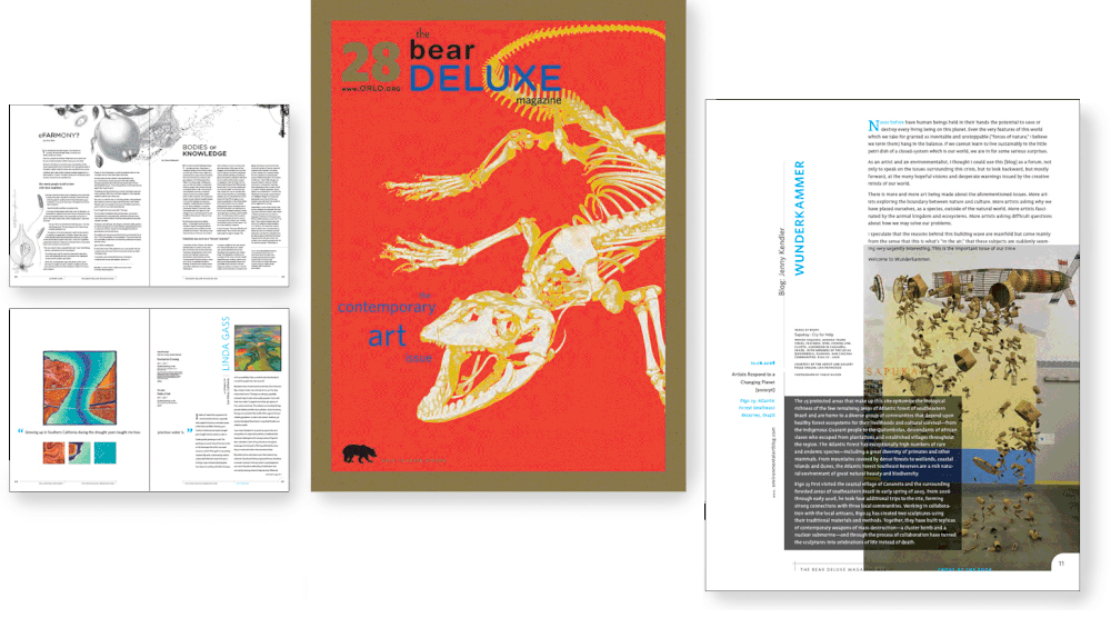
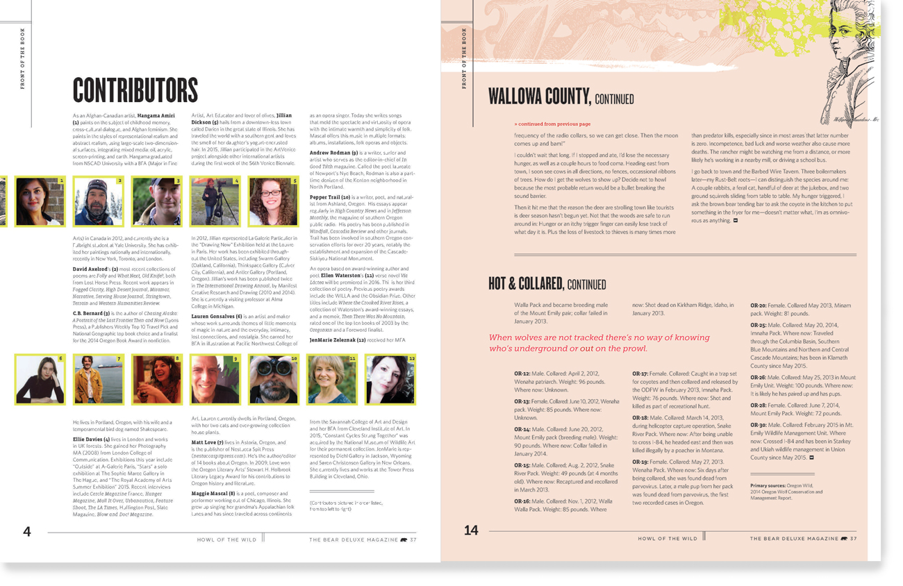
The publication traditionally prints on kraft paper in four or five spot colors on a web press, which presents unique printing challenges. As art director, I wanted to push the capabilities of these production methods, using my understanding of screen printing and book production to emphasize an artful look with inexpensive printing. Printing on kraft paper, traditionally used as packing and wrapping material, became part of our brand as an environmental art organization: celebrating "trash" materials, seeing their beauty, making them art.
Website
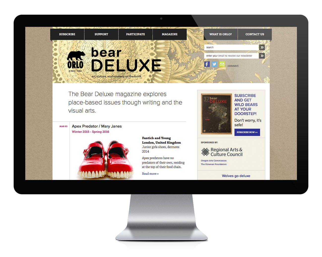
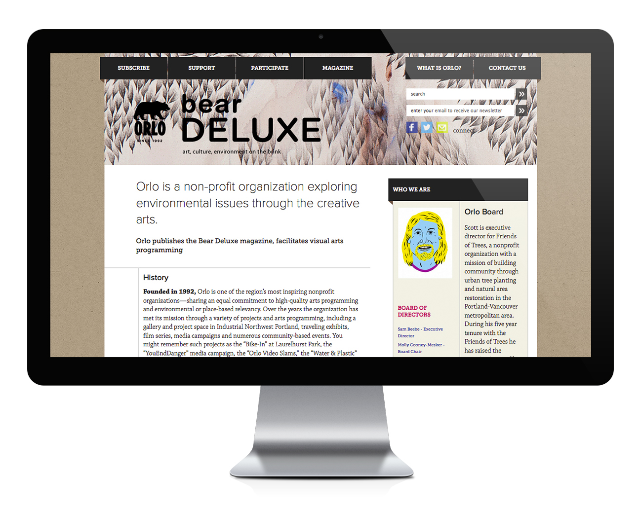
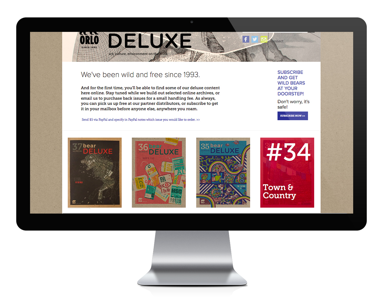
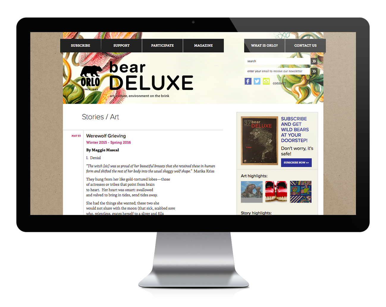
Previous sites were built and administered without a content management system (CMS), keeping us from reaching our audience with current content and information for grants and funding. The site looked and read as dated, even when content was fresh.
"Orlo, Italian for “on the brink” or “edge,” defines the independent spirit of our programming."
SOLUTION
With strong colors, I mixed PMS spot colors in channels, built in overprints, and compensated for disappearing opaque whites by allowing press people to tint them with color on press to work well with the brown paper.
Textured edges are built into the designs to emulate imperfections of hand-pulled prints. Off-register layers are built in to the designs to give in to the imperfect registration that can happen with a fast-moving web press and slippery kraft paper. Building relationships with our printer allowed me to experiment on press. I designed to be flexible where results could not be controlled, allowing room to get the best results without waste or additional cost.
The result is covers that print on the same presses that manufacture the coupon tabloids, but look like silkscreened posters.
Interior templates were built on a five-column, flexible grid system with strong, clean type that would create more unity within the magazine and allow the art to shine. Layouts are offbeat but adhere to the grid; the "syncopated" design felt right to showcase art, poetry, writing, and design on the brink of being discovered.


Web
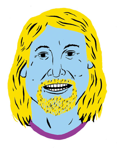
Interviewing readers, our board, and working groups to develop a site structure and UX, I created front-end designs for our first website built on a CMS (WordPress). The site uses a strong grid structure and type that honors the print magazine, but reads better on the web. Custom textures, a punched-up CMYK color system, and a rotating art banner at the top of the page remind users of the physical product. Illustrated portraits of the organization's leaders, commissioned in our new colors, humanize the organization and make a disparate group feel like the team we are. User profiles allow multiple volunteer contributors to add content on the fly.


Results
All of my cover magazine cover designs were featured in the PRINT Regional Design Annual. We published many prominent artists and illustrators at the beginning of their careers, making work with an environmental focus from all seven continents.
Utne recognized us for design excellence. We won grants from several prominent sources, including the Regional Arts and Culture Council and the Kinsman Foundation. We received Portland Monthly's Light a Fire award. Designers I mentored went on to work with Wieden + Kennedy, become prominent fashion designers, and work with PICA.
After launching the website, we were able to establish a new fiction award judged by Oregon Book Award winners, fund five years of the magazine, and begin transferring an archive of great content online for future reference. The site is still in use.